Easy to Act
Did we make it stupidly easy to take the next step?
The call to action should be the top of the visual hierarchy, it should be the first thing you see within a second or two and someone who does not speak the language should be able to pick it out.
- Make it bright and contrasting, like ripe fruit in the jungle. Often 180 degrees on the color wheel from the main brand color is a good place to look for a CTA color.
- Make the call to action easy to find at all scroll states, and especially at the right moment, e.g. when a user has just read a powerful statement or has reached the bottom of the page.
- Consider giving options at the point of contact. Email vs form vs phone vs chat work differently, and sometimes better in combination. For instance, in our experience engineers love to email, event planners prefer to call.
Simplify Conversion
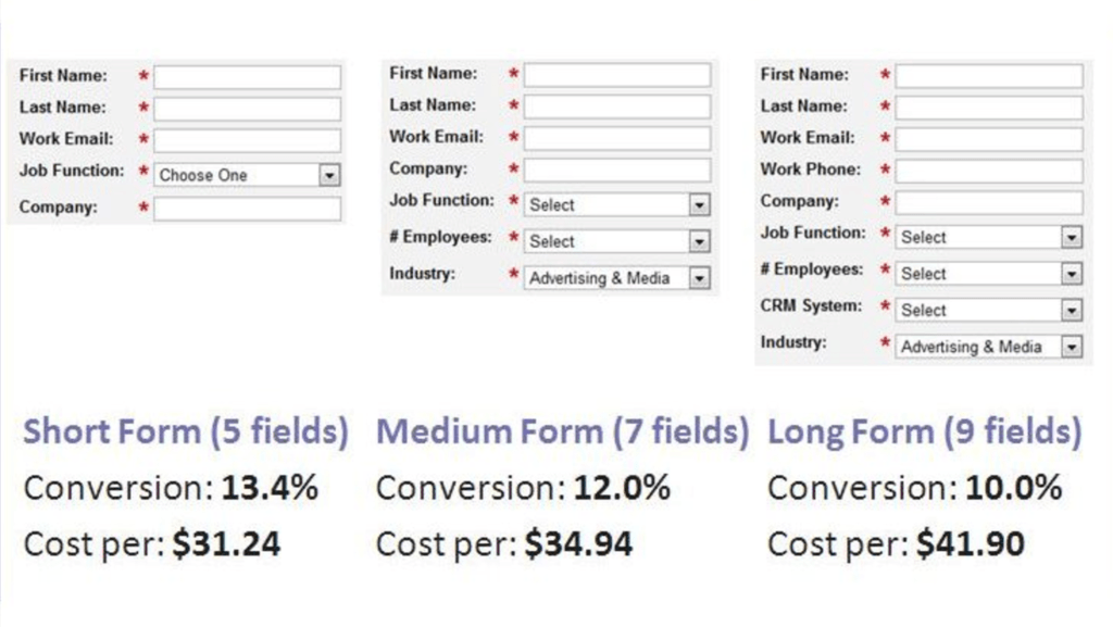
Can we eliminate a step in conversion?
While not always true (and definitely worth testing), in most cases you can increase conversion rate by reducing the number of steps and/or fields necessary to convert. Extra information like ‘How did you find us?’ can be sourced later, after the lead has been secured.
Speed & Accessibility
Did we make sure the page is fast, usable and accessible?
A web page isn’t a book. People engage differently with online content, in much less linear ways. The following can all help:
- Make the page skimmable.
- Ensure it loads fast. Speed matters! Walmart saw up to a 2% increase in conversions for every 1 second of improvement in load time.
- No sliders or autoplay – people want to control their experience.
Scarcity & Aspiration
Did we leverage marketing themes of scarcity and aspirational belonging / lifestyle?
The fear of missing out is powerful, as is fear of negative consequences.
- Time limited offers and other scarcity signals don’t always make sense, but can be powerful in the right situation.
- Demonstrate that not converting has consequences. Sometimes, fear sells.